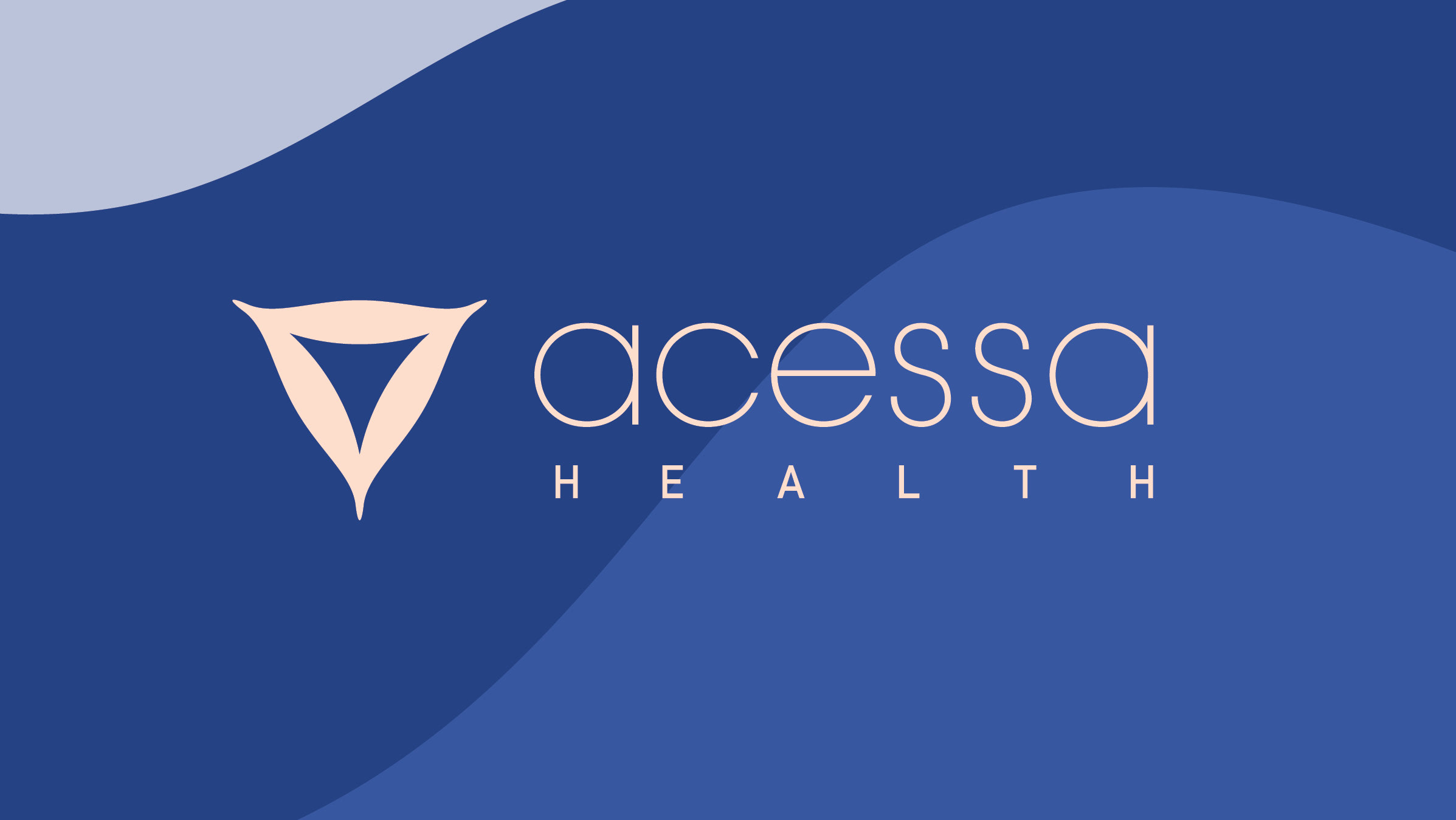
Acessa Health
Role: Art Direction/Designer/ Illustrator
Agency: OBERLAND
Agency: OBERLAND
CD: Sophie Forman | CW: Devon DeSanna + Becca Abellera | Executive Producer: Kelsea Seavey | Motion/Illustration: Alex Borelli | Editor: Helen Todd | Production Agency: Apostrophe | Photographer/Director: Anna Wolf
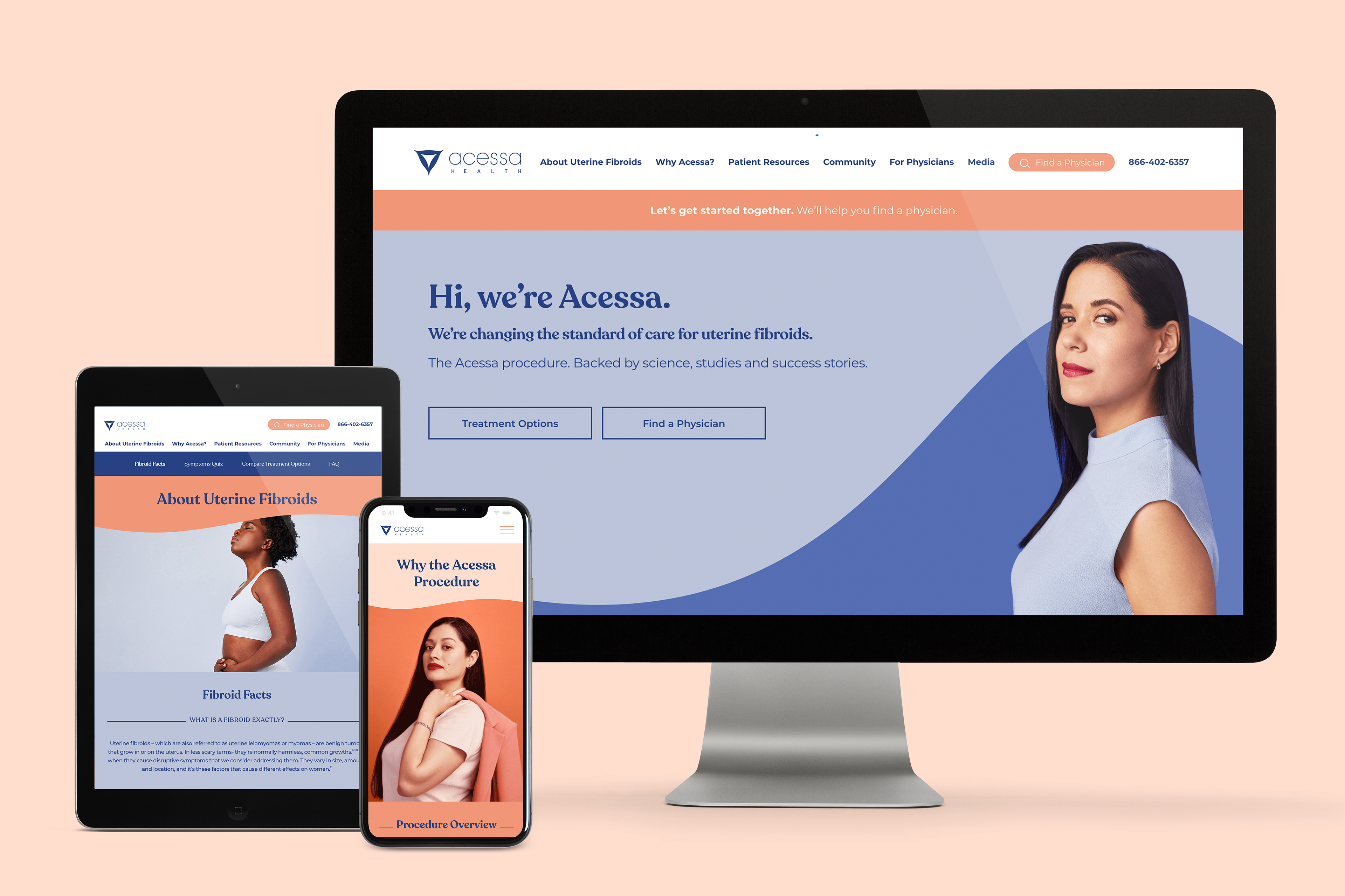
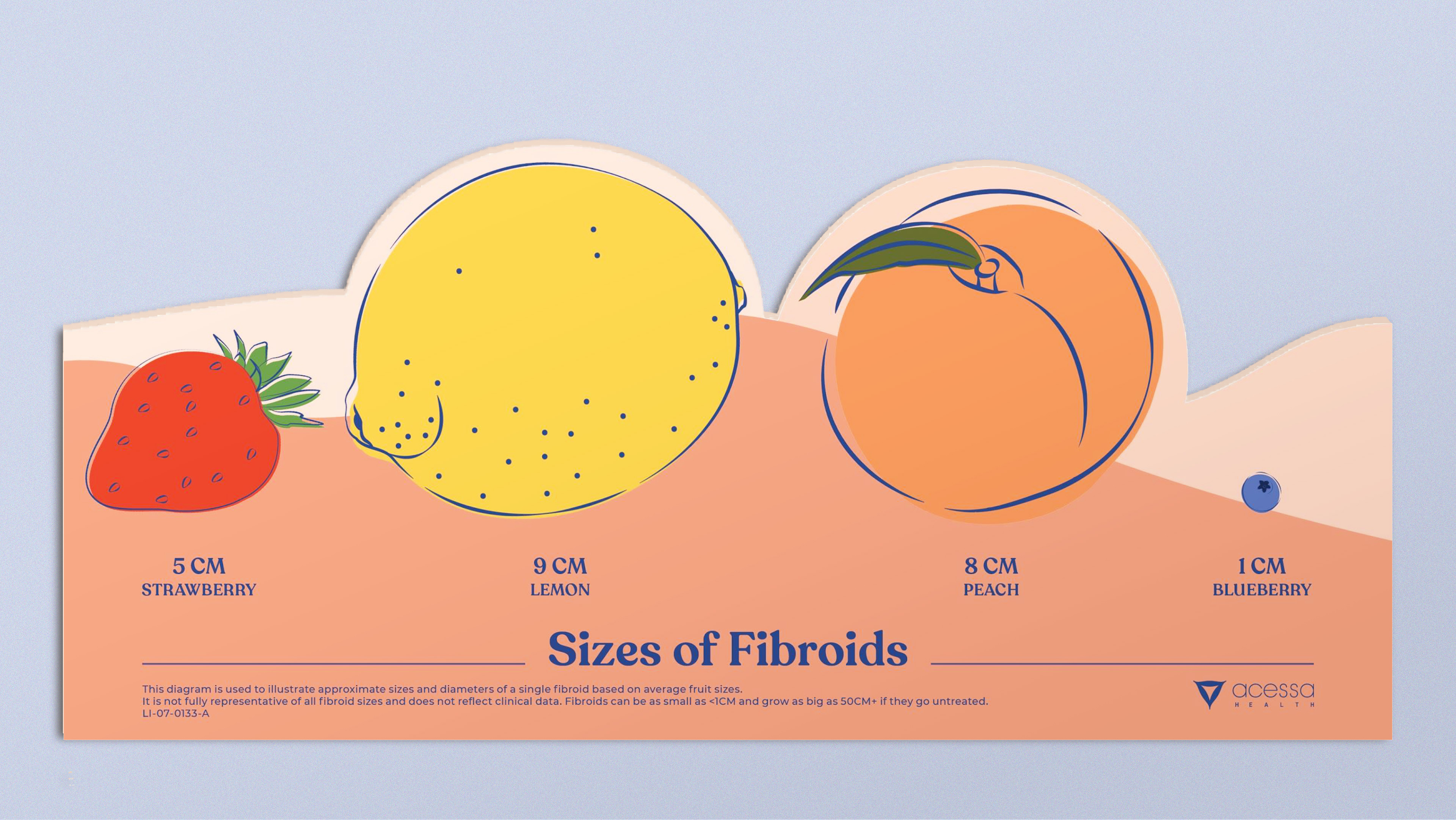
Acessa is a women’s health company that offers women a less invasive option to treat uterine fibroids. OBERLAND has built Acessa a new brand identity from the ground up. Using the new tagline "Making Women's Health Healthy" the brand centers around the strength of real patients who have fought for better options.
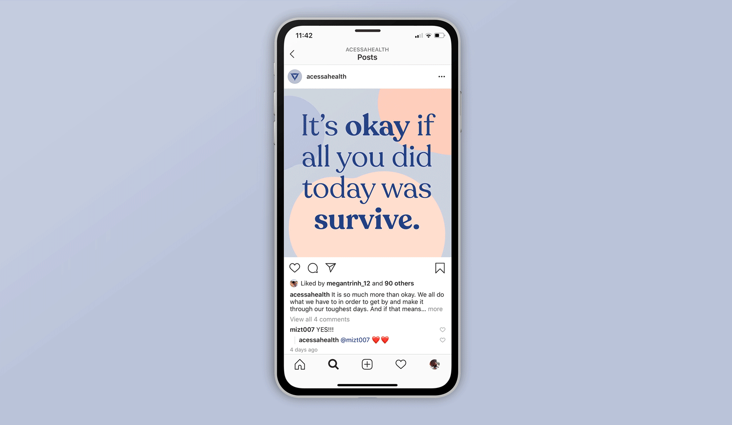
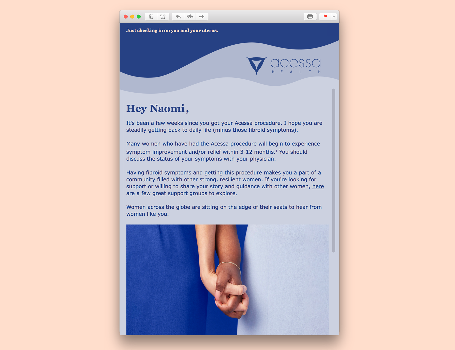
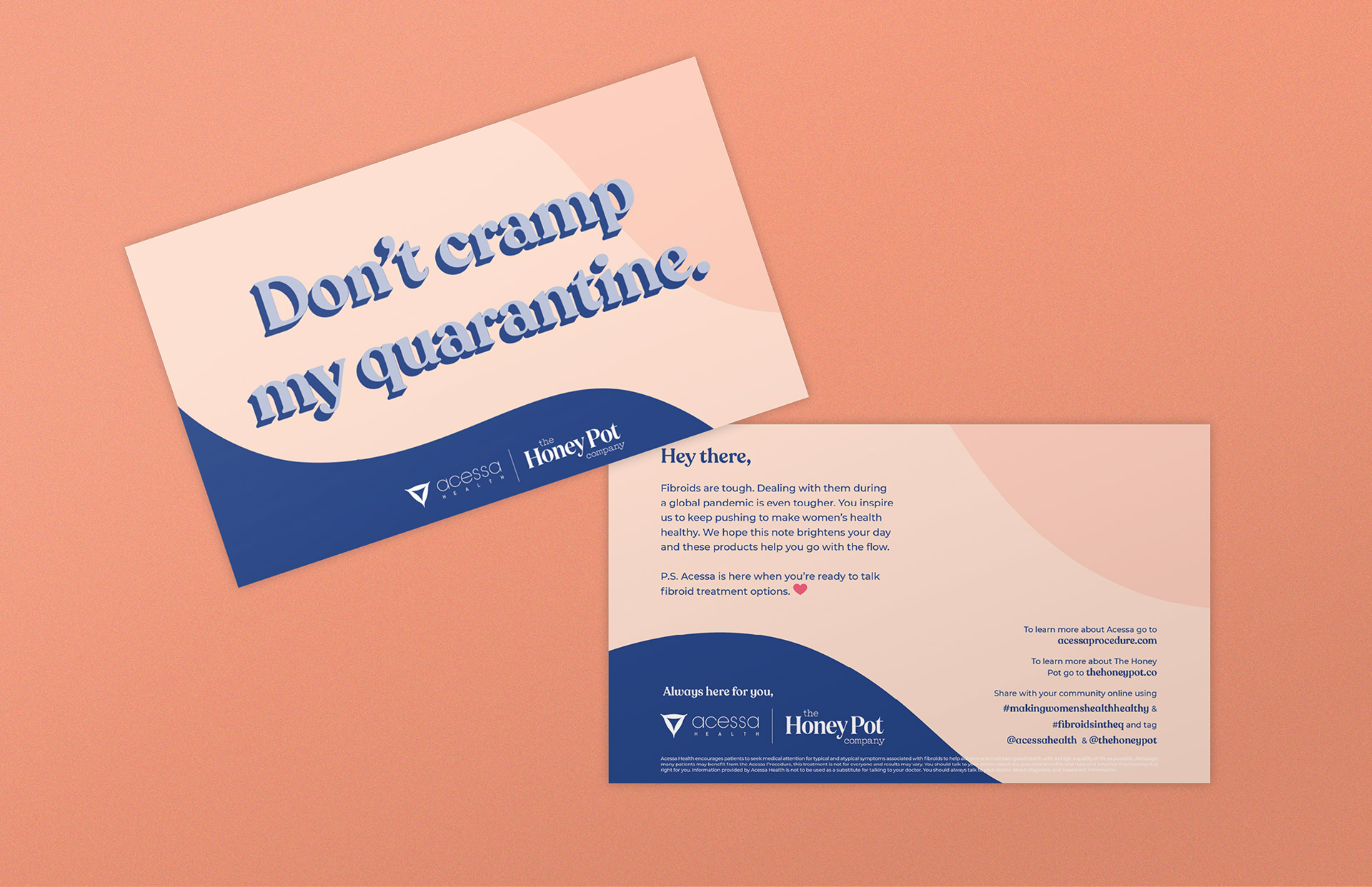
Acessa launched its new brand with a complete rebuild of their website. With this site OBERLAND sought to create a space that is informative and compassionate, but also bold and empowering. The site has become a touchstone that informs the rest of the brand's design, which includes a large scope of materials such as social media campaigns, patient materials, physician facing documents, internal corporate materials, a full suite of brand guidelines, and much more.
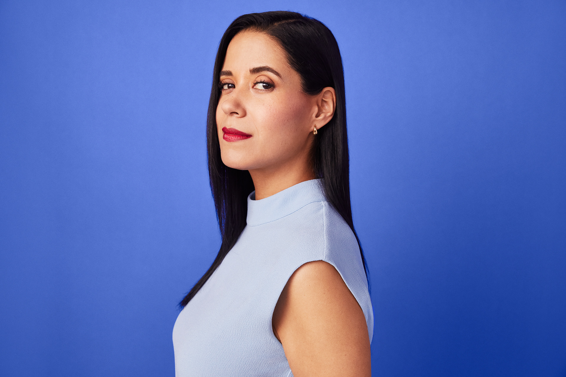
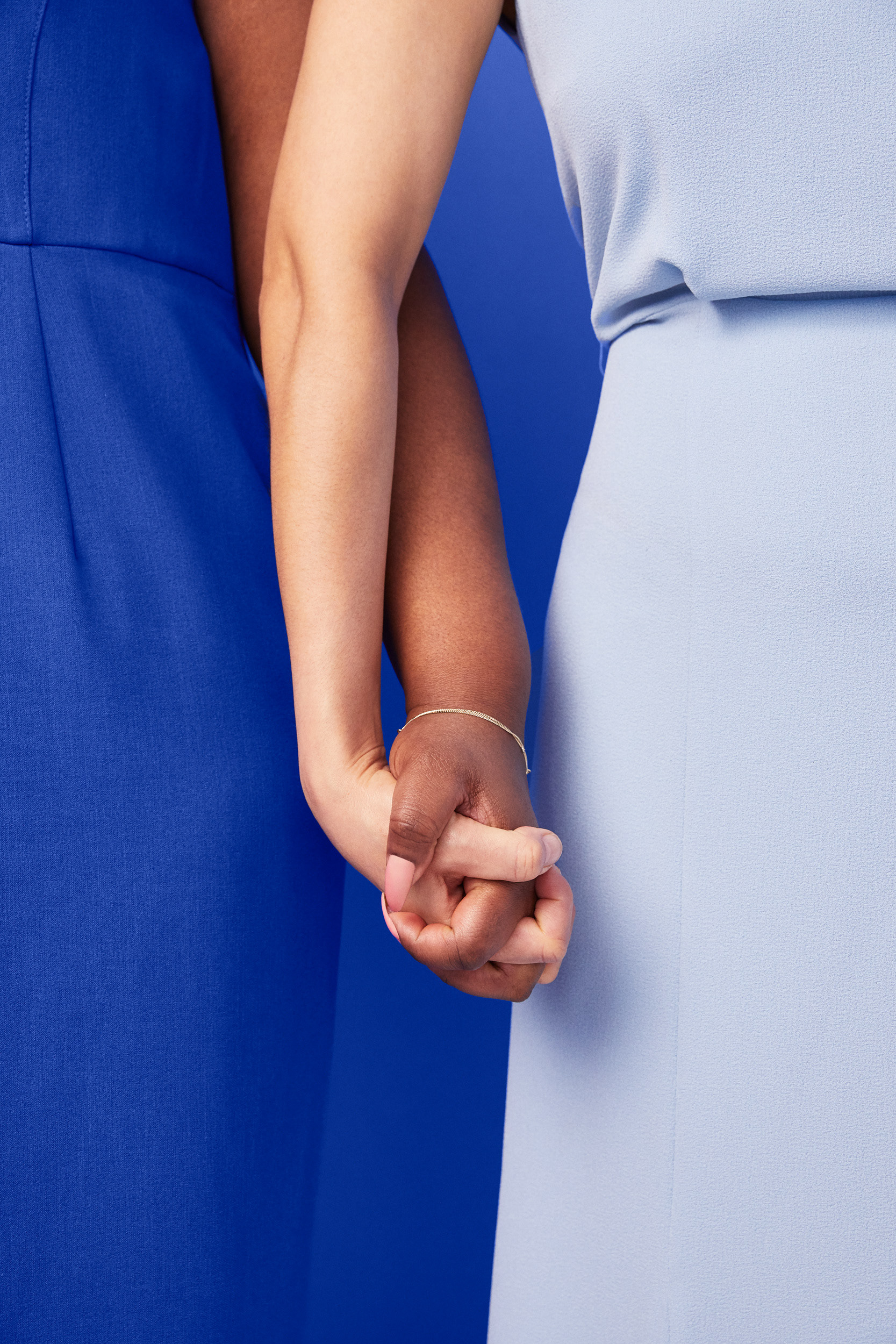
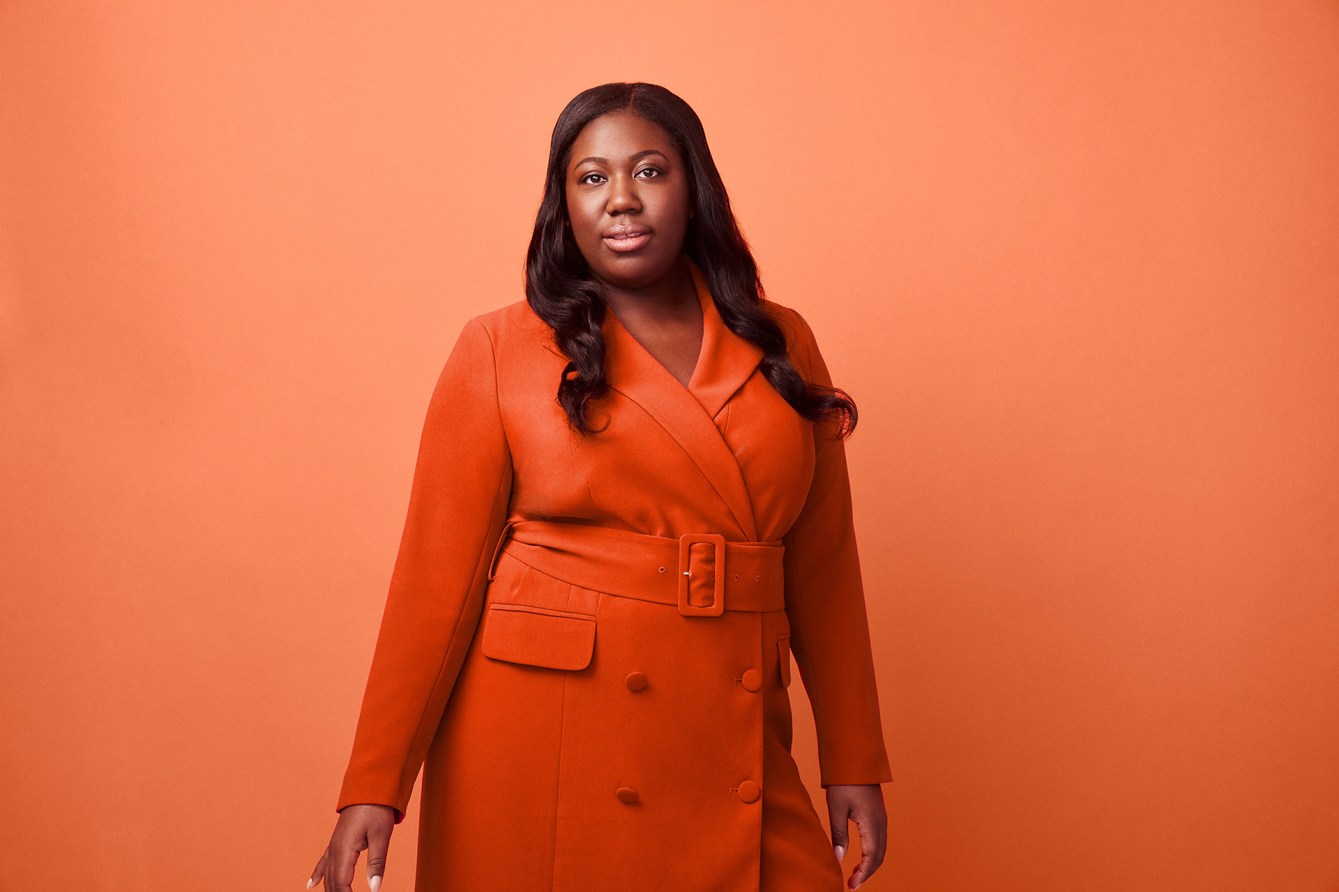
Much of Acessa's brand is informed by a contrast of compassion and strength. The color palette is made up of soft and feminine leaning blues and peaches which are accented by bold, saturated hues of the same colors. The same is seen in the photography which contrasts a single color backdrop with real Acessa patients dressed in matching hues, creating a singular focus on the women who have been empowered by the success of the Acessa procedure.
See the Acessa site here.